
This is a look at a composer package that returns an SVG graph from an array of data: shortdark/socket composer package. There may be better ways to display graphs on websites with existing open source code, such as javascript libraries. I wrote the original code from scratch and show the history of myself working with and modifying the code. I also discuss updating the code to work as a composer package, some anomalies and how these affected gathering the data, and tweaking the composer package to make it work for any conceivable situation.
This composer package may not be very useful for anyone other than myself, but it is an exercise in coding. Specifically, it's an exercise in adding functionality and refactoring slightly, rather than an example of what I believe to be perfect code or a particularly good use of PHP. I'm using this code as an example to discuss because the code is 100% my own and has never been used on any client website I have ever worked on.
History
I created a stats area in around 2014/15 that showed the monthly stats for one of my websites at the time, the stats were concerned with how often I updated the website. I modified the code, and it was my first GitHub repo: my original GitHub repo. Below is something like how this code should look. The line shows monthly updates and the bars show the average for each year...
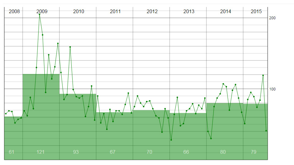
Quite soon after this, I separated the database from the graph. To begin with I believe the database parts were removed from the code and an array was passed in. The data did not change very often, so one version used cron to make XML files once a day then the XML was used to make the graph. Other versions used JSON. Here is a multi-line version of the graph...
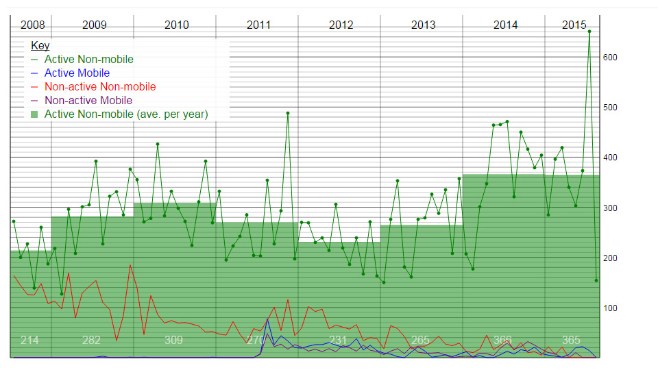
At the same time as making the line graphs, I also made pie charts, bar charts and world heat maps.
Another use for the line graph code was to display sterling against other currencies, in the graph below. There are two Y-axes, CNY uses the red axis on the right and USD/EUR using the black axis on the left...
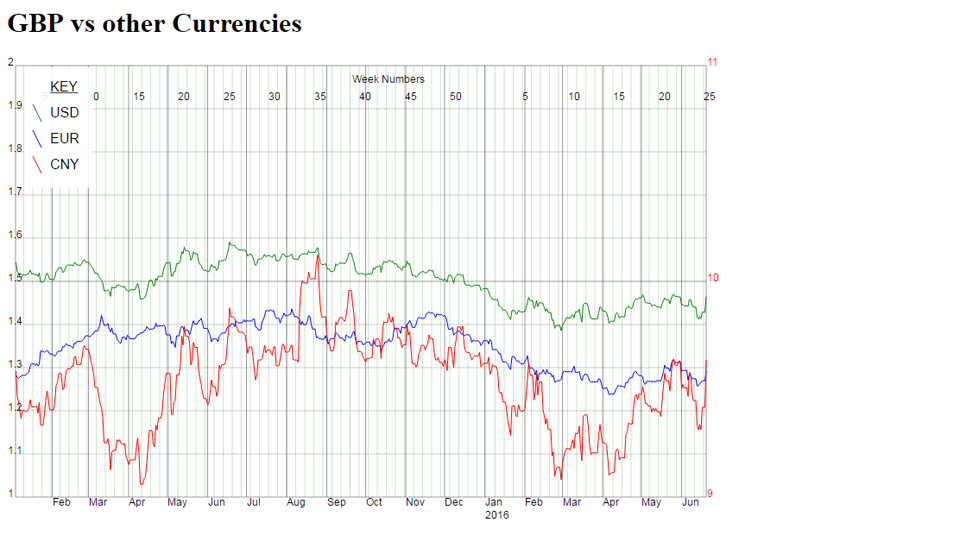
The currency graph used javascript to fit the graph to the size of your mobile device. The SVG itself is not mobile-friendly so altering the height and width of the graph to match the screen size was a neat way to make it work on mobile devices.
Up to this point each graph was similar but different. Things like combining line and bar charts, and changing axis for different data made each graph quite specific to its use case.
When I made a WordPress plugin it also used statistics and graphs. This time the WordPress plugin showed a specific metric, but it was general enough to be used on any WordPress blog. The plugin can show a line graph for tags, categories and any custom taxonomy the person has added. The plugin also displays data in bar and pie charts...
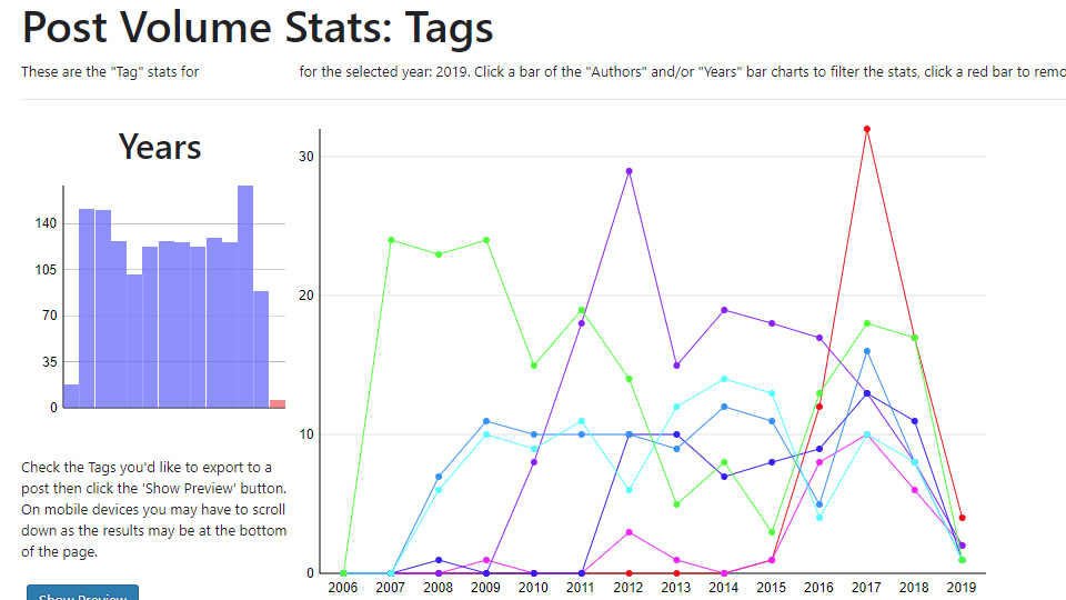
To display this data graphically, you can make the case for using javascript and/or using a pre-existing library. But, for a WordPress plugin, making the graph with PHP and not having any dependencies worked really well.
The WordPress plugin, Post Volume Stats is still available on the WordPress plugin repo.
Putting the Code Into A Composer Package
Starting to keep the graph functionality separate from the database made it very straightforward to put the code into a composer package.
The shortdark/socket composer package was originally code that I had written and used somewhere. I basically copy-pasted the code with some slight tweaking to make it work as a composer package. With the code being old and because it was originally being written for a specific task it had bugs. The code needed improving generally, and the functionality needed tweaking to make it work for a general case.
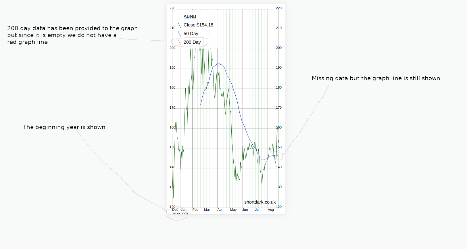
In order to show the graph working, I've used stock market data. You can select one or more stocks and pass them into the graph in an array. You are able to look at one stock (with 50 day and 200 day moving averages), or you can compare up to 10 stocks on one graph.
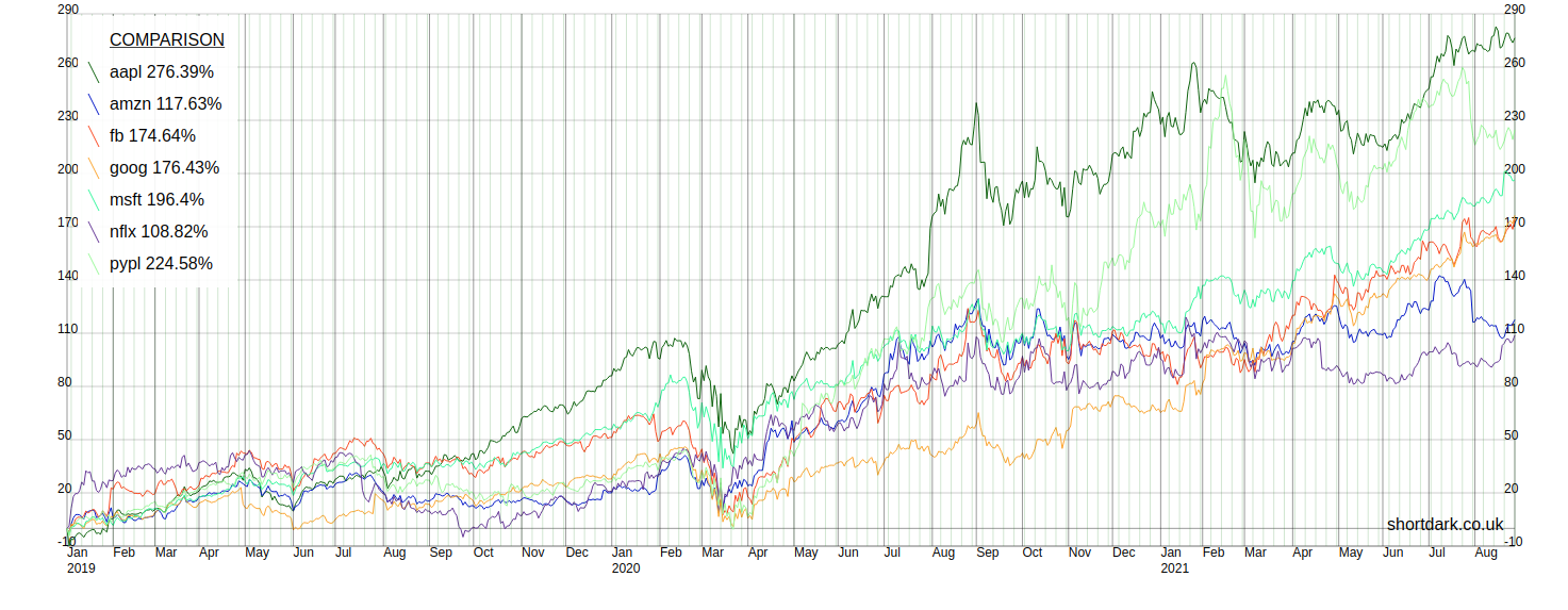
You can change the start date of the data as far back as I have the data collected. The end date will always be the previous weekday unless the stock(s) being shown have ceased trading.
The only reason I have suggested that 10 lines be the maximum is that I was starting to run out of unique colours. As it is, some colours look pretty similar to my eyes. The composer package allows you to have as many lines as you wish if you specify the colours you want to use for all the lines over 10. Presumably, if someone was to do this they would want to change 1-10 too.
Usage
Three stages...
- Get the data from the API, check it and store in a database once, 5 days a week.
- Process the data and put it into an array.
- Use the array to make the graph.
1. The API
Apart from my time, two things cost money with this project: the server and the API. I wanted to only make an API call when I needed to. The data does not change over the weekend, so I do not make any API calls for the weekend days. Then there are several other checks the script goes through before we even hit the API. The list of stocks only includes active stocks that has a start date and not an end date, then it checks that we do not have the data already. So, we only hit the API when we're pretty sure we need to.
Now, that we're calculating moving averages for the stocks ourselves, when we collect the data we update the moving averages. Calculating two averages per stock should not create too much of a load, but even so I do not want to go attempting a calculation if it is not needed. Before I attempt to create an average I make some more checks so that I'm not wasting computing power.
An anomaly concerned with getting the data from the API was Reckitt Benckiser changing it's name [^1]. The issue here was that it also changed its Tradable Instrument Display Mnemonic ("TIDM"), or ticker, from "RB.L" to "RKT.L". Unfortunately, on the day the name changed the old ticker stopped working and the new ticker began. The API call identifies the stock from its ticker, so we had a problem. The two tickers (old/new) are set up as two different stocks with the correct start and end dates. Once we have all the data the old ticker is made inactive, so it will not appear in the list of stocks to update. I'm sure this will happen again, so it's good to know there's a quick fix.
2. Processing Data
The data is just taken from the API and all the graph is doing is taking an array and displaying it. The hardest part of the project is probably processing the data into an array that will give us the graph we want. The effort I have gone to in only calling the API the minimum number of times should mean that the data is perfect, but it may not be. On days when the API is behaving strangely there may be gaps in the data. Whatever data we've got on the database we need to get the composer package an array it can make a graph out of, i.e. we have to present the array in the correct format for the graph to read it.
While there's not a huge amount of data there is enough that we need the database to be indexed. We also want to be fairly careful with what we're asking the server/database to do on common actions. Doing the heavy lifting once a day when the data updates allows the data processing to be fairly quick when we want to view a graph.
3. The Graph
Creating the graph with a composer package ensures the final stage of the process is completely separate. It's on a separate GIT repo. Being able to modify both repos mimics a larger website where there may be different parts of the website may be completely separate to others.
The graph class itself is pretty simple, and I've tried to break it down into methods that are fairly small and well-named. I also wanted it to be as customizable as possible, so instead of hard-coding anything we are able to change the settings when we call the class. Other than the user defined settings there are some rules concerning the data.
To make the graph the same size as whichever device is viewing the content I use javascript to pass the height and width values into the graph. This javascript is pretty old, and it does not behave 100% correctly with modern phones with curved screens. In the example screenshots the wide graphs would be from a computer monitor and the narrow graphs are simulating a mobile screen.
Anomalies Discussion
There were four memorable anomalies that arose during developing the package, other than the company changing its ticker symbol, which I've already discussed...
- Stock Splits
- New stocks getting listed.
- Public holidays and missing data.
- Public companies getting acquired and ceasing to be publicly traded.
I'm going to discuss these anomalies and show with some discussion and screenshots to show how some bugs were fixed.
Most of the issues arose because the code was copy-pasted from old code and had a specific use case. The code really didn't need a huge amount of untangling, there were a couple of places that mainly needed simplifying.
Stock Splits
The NVDA stock had a 4:1 stock split on 2021/07/20 [^2]. Below, is how this affected the data we were collecting from the API.
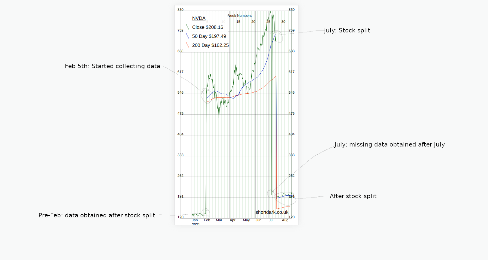
- On the date of the stock split there is a dramatic drop in price.
- After the stock split the API adjusts the historic data to be equivalent to that after the split.
The easy way to fix this was to update all the stock data to match the new post-split data. Then the chart looked less crazy and showed the change in stock price more accurately.
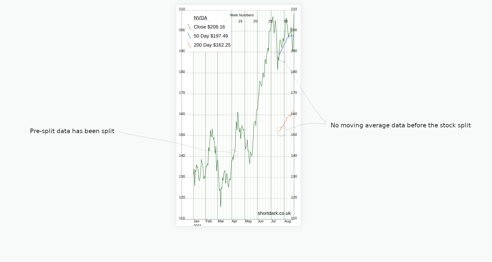
The 50 day and 200day moving average data is missing in the new data. The moving averages came from the API and were not calculated.
Calculating the averages on-the-fly on every page load would be too much workload. Creating and storing the averages in the database would ensure that the graph would not load any slower. Which I eventually did.
Another change in this version is that I have made the week numbers across the top optional. As no-one is using this composer package but me I made the default not to show them. Ideally when making some functionality optional the default would be to make the previous functionality the default, so that people who are using the code do not update composer and wonder why something is missing.
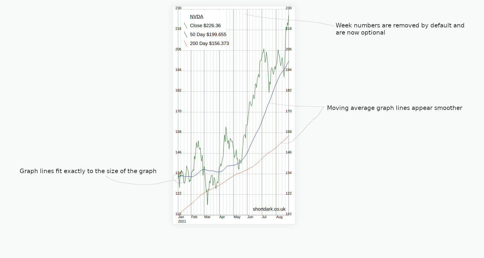
I have seen a few different websites all give different values for 50 and 200 day moving averages. I'm not sure if there is one universally-recognised way to calculate them. My way is different to the previous values, but I have seen different versions that are different again.
How to deal with stock splits in future
There is an API that gives stock split information. If I trust the API I could deal with stock splits automatically in the future.
While I don't mind hitting an API once a day for a test project like this, I do not want the possibility of an API causing this project to do a lot of unecessary work without my knowledge. The safest thing would be for the API to flag up a possible stock split, then I could manually approve it.
New Listings
New listings have no data before the IPO date. That just means that the earliest the single graph can show is the IPO date.
The graph composer package simply displays the data you send to it. It does not make decisions on what to do with different data.
When we display the data for a single stock the graph will only show the dates it receives in the array. When we're comparing a stock that has recently been launched to other older stocks, we need to make a decision which data we want to put in the array we send to the graph.
From a previous version of the package we have the Paypal and Square data from the start of the year, so we can compare the two like this...
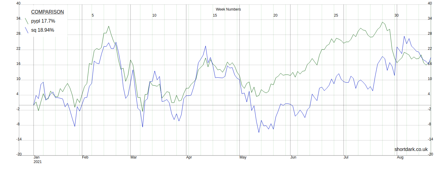
But, if we want to compare Paypal and Square to the newly public Coinbase, we have a choice to make. Either we show the two lines in full and only begin the third line when it starts trading, or we simply start the graph when all three stocks are trading. I have decided that we have to start at the IPO date or later. This is controlled by the array we give the graph, if we wanted to display different data we change the array.
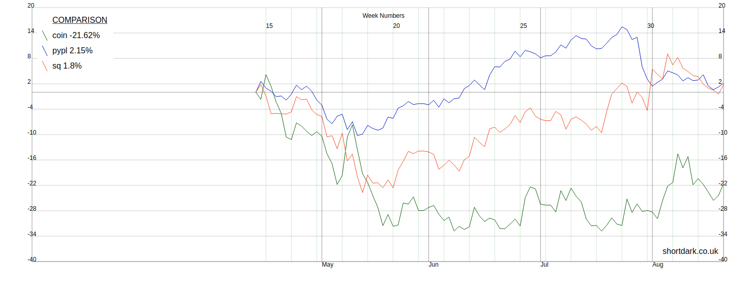
At the time I took these screenshots, the graph was able to squash the graph so that the full range of data it receives is displayed, but it did not stretch so that shorter date ranges fill the whole graph. I have now changed this, but at the time the issue was that there was a bug that meant the graph lines were crossing the Y-axis.
Public Holidays and Missing Data
Originally gaps in the data caused problems in the graph. This was due to the original implementation not expecting any gaps at all. This new composer package was therefore not processing the missing data correctly so the graph was not getting displayed correctly.
We need each line to be continuous without gaps so filling in the public holiday data with the data from the previous working day. This was a simple and cheap solution because I did not need to make any API calls. Once the public holiday days had data the arrays going into the graphs did not have any gaps and so the graphs looked normal. This was a one-off script.
The next step was to modify the graph code to allow gaps in the graph lines. This means that if the API stops sending data for a period of time the overall graph will still be able to be displayed as normally as possible. Now, we are able to have graph lines that can be broken (start-stop-start-stop).
Acquisitions
The day after Nvidia's stock split, on July 21st, 2021, Salesforce completed the acquisition of Slack [^3].
Acquisitions or de-listings should be similar to new listings, and they are basically the same. As long as the data going into the graph is correct it should present a graph that stops on the final closing date. The value of the stock after acquisition can't be zero because then on the percentage graph you would get something like this...
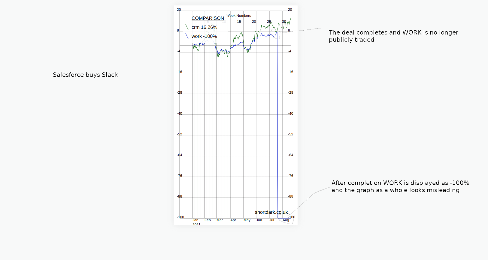
So, the solution is to make sure the value after acquisition is null. Then, if the first (most recent) data point is null the graph must know how to deal with this.
In the same way that public holidays were not correctly dealt with if the data was missing, the graph package did not deal with the first data point being null very well either. Changing the data in the array from zero to null, and fixing the graph to deal with null values better meant that the graph looked less crazy...
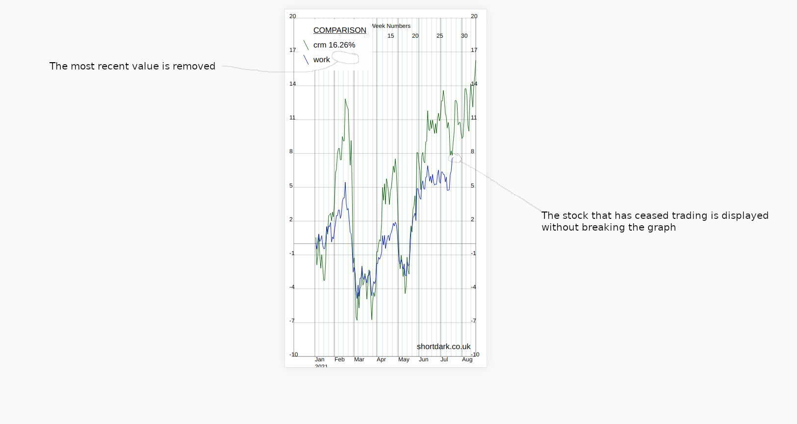
Missing data points (null values) are not displayed but all the data points that are supplied get displayed.
Composer Package Development
In developing the composer package for this test website, I have already discussed some changes made. Here is more discussion about some issues and changes.
Week Numbers
For fairly short periods of time week numbers across the top of the graph looked ok but for larger periods of time they made the graph look overly fussy.
The original graph that showed the website stats showed the full range of data, but other graphs such as the currency graph only showed the last x rows of data. In this case we are leaving it up to the user of the package to decide how many rows of data to send into the composer package. The composer package is told the graph width (number of pixels) and it knows what the date range is from the array that is passed in so we could tailor the week numbers to this information.
However, I hadn't looked at the week numbers part of the code in some time and wasn't entirely certain that it would be correct. The easiest solution would be to allow the person to decide whether they wanted the week numbers or not. This was what I did, although I could well take this a step further and allow the week lines to be turned on/off too. Comparing the graph to the version I used on the Post Volume Stats plugin, the lines are very busy, removing all the horizontal/vertical lines apart from the axes should probably be an option too.
The Width of the X-Axis
In my original code the space between the points on the X-axis was fixed, then it became a public variable so that we could customize it. I wanted the X-axis to completely fill the graph without any awkward gaps at either end. I did this by overwriting the variable that specifies the width between the data points. This works great.
What this means is that the variable is no longer public as it is modified depending on the min/max values of the data it receives. Therefore, the variable that would get overwritten should it be specified, becomes a private variable.
I'm not sure if there would ever be a use case where someone would not want the X-axis to fill the whole graph. If there was, keeping the variable as public would be ok, because there would be another boolean that controlled whether to use the value or not.
Length of the Month Name
If the graph is being viewed on a desktop, and it is only one year of data the length of the month name is probably irrelevant. However, if more than one year of data is being viewed on a mobile (landscape or portrait) there can be some overlapping of the words for each month in the 3-letter format.
In the current version of the composer package, as I write this, the X-axis expands or contracts to fill the width of the graph. When we give the graph a width the code tells the graph to expand/contract, so it fills the X-axis, so we know the number of pixels between each data point on the X-axis. Therefore, we know the width in pixels between the lines that show the start of each month. I have not done this yet but knowing the size of the space that each month word occupies means that we can estimate whether we want the full name, the shorter 3-letter name or the one-letter version of the month name. This could be automatic or could be customized manually in the public variables.
The Width of the Legends Box
Similar to the month names, currently the width of the legends box is manually specified in the customization options. This is impractical. I'd like to take another look at the text and see if it is possible to figure out the maximum width of the content of the legends box. Looking at the code quickly, I can see that we can specify the font family and font size in the SVG. Knowing this information we may/may not be able to predict the exact width unless we pick a font where each character has the same width, i.e. a monospaced font.
I'm currently using generic "sans-serif" as the font. Having a font as generic as this actually works pretty well because we may not know for sure which fonts are available to PHP on the server it is being used on. An alternative would be to either find a monospaced font that is guaranteed to be available on every operating system. I can see from my own Linux machine there are several mono fonts, but I'd need to figure out whether any of the mono fonts I have on Linux are available everywhere that PHP 7.0 can be used.
Or, we could also include the particular open source font we wanted to use in the composer package, or link to a CDN in the code, if this is possible. From a quick search, a font that is both open source and monospaced is "Inconsolata", it looks pretty nice. I cannot remember whether I have ever tried something like this with PHP in an SVG, this might actually be the best solution if it works.
I'd rather not modify the length of the legend strings in the graph code. It is better for whoever is sending data into the graph to limit the titles to reasonable lengths. That said, it is possible for any length of text to go into the graph, so perhaps we can discretely deal with huge amounts of text.
The Y-Axis
Currently, we say that there should be 10, I think, iterations on the Y-axis where we label the value at that point. The spacing is regular and ideally the Y-axis would start off at 0 and end at a number like 100 so that each iteration is 10 and the graph looks neat. But, we don't know what the data will look like. It is not uncommon for the spacing between iterations to be 7 or something strange like that.
Currently, when all the data points are much higher than zero, instead of always starting the Y-axis at zero we find the minimum value and use a sensible-looking starting point somewhere below that. This works quite well and works the same whether the lowest number is positive or negative. If the graph goes from negative to positive, zero is not always one of the labels on the Y-axis, so I have added an extra horizontal line where zero would be. An alternative would be to move the X-axis labels up to zero and potentially have line(s) obscuring the month labels.
If we could potentially choose how many iterations we want, and we're specifying the start and end of the Y-axis, combining these together to make uniform iterations is possible. The start and end is always a multiple of 10, so we could say that if the range is more than 100, there is an iteration every 10, for example. When the range is below 100 we would limit the iterations to only be every 10. Then, there would just need to be a rule to follow when the ranges got too big, for example ranges of 2000 or more.
General Thoughts
- snake case -> camel case. A mix of different styles in the code old/new.
- Based on very old code.
- Very simple package, one file, no structure. There is only one public function. Refactoring out so that classes were more ordered might be good. For example, the legends box could be in a separate class, especially if we're considering making this more complex.
- No TDD.
- Only tested with one suite of data (stocks).
Summary
Making an SVG with a PHP composer package may not be the best thing to do for all use cases. I've talked about this SVG graph composer package with some history to show where the idea came from.
The issues that arose when using the package initially were sometimes down to the data, the processing of the data or the graph. We can't always control the quality of the data from the API, so by making the data as complete as possible when we collect it, then understanding what data may/may not exist we can create a graph that shows what we want to show. Many of the bugs were solved by simplifying and modernizing the code. These changes also make any future changes much easier.
I've highlighted some areas where I may make some changes in "Composer Package Development". This is just a personal project and there are personal projects that are possibly more deserving of time. I'm probably going to make some further tweaks. I'm going to try to limit myself to either making changes that add functionality or that are useful because they let me try something out.
References
[^1]: RB rebrands as Reckitt [^2]: Nvidia Stock Split History [^3]: Salesforce Completes Acquisition of Slack
